Maply gives you finer controls on the look and feel of your heat maps.
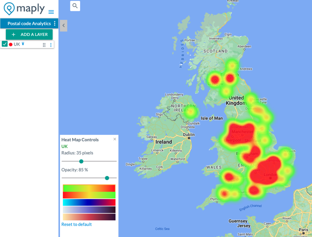
You can customize them in the following three aspects:
- Radius – The radius of influence for each data point, in pixels. Default value is 20 pixels.
- Opacity – The opacity of the heat map, ranging from 0% to 100%. 0% opacity means 100% transparency while 100% opacity means 0% transparency. Default opacity is 70%.
- Color gradient – different options on colors to represent density of the heat map
Any changes on the three parameters above will be reflected instantly on the map, so you see the effects immediately and make adjustments till the visual is optimal.
Heat Map Controls will be displayed automatically when a map is on heat map view.
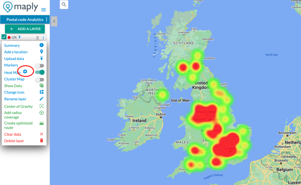
The controls can also be opened from heat map setting icon, as shown in the screenshot below.
Pro Tip
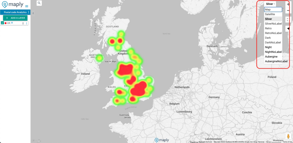
You can also try out different map styles to see which one matches to your selected heat map colors perfectly.