When you’re responsible for a network of brick‑and‑mortar locations—whether they’re retail stores, medical clinics, warehouses, or delivery depots—one question pops up again and again:
“What percentage of my customers live within a reasonable distance of my locations?”
Getting a reliable coverage score isn’t just a feel‑good metric. It guides where you open the next site, which markets need more marketing spend, and how you set realistic service‑level agreements. Below is a fast, repeatable workflow you can use in Maply to turn raw address lists into a clear coverage score—no GIS degree required.
Why Coverage Analysis Matters
- Customer experience – A 50‑mile distance may be fine for rural areas, but it’s a deal‑breaker in dense cities. Quantifying coverage keeps expectations grounded in data.
- Network planning – Knowing that you already cover 82 % of customers within 50 miles might reveal that a new location in that region offers diminishing returns.
- Cost control – Delivery distance affects fuel, labor, and cold‑chain viability. Shrinking the average trip length by even a few miles can save thousands per month.
Before You Start: Gather Two Lists
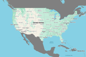
- Customers – One row per customer (or patient, employee, etc.) with columns for name, street, city, state, and ZIP/postcode.
- Stores – One row per physical location with the same address fields.
Maply geocodes these for you, but clean addresses mean fewer “unknown” pins later.
Step by Step: Build Your Coverage Map
| Step | Action in Maply | Purpose |
|---|---|---|
| 1 | Create a New Map | Gives you a blank canvas. |
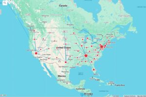
| 2 | Add a Location Layer → name it “Customers” | Keeps data organized. |
| 3 | Upload your customer list | Drops pins for every customer. |
| 4 | Add another Location Layer → “Stores” | Separates stores from customers visually. |
| 5 | Upload your store list | Pins each store. |
| 6 | Style your layers | Make stores red stars, customers blue circles (or any scheme that contrasts). |
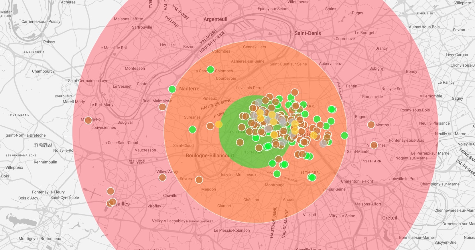
| 7 | Select the Stores layer → Add Radius Coverage → 50 miles | Draws a buffer around every store. |
| 8 | A new “Radius” layer appears | This layer is purely the coverage bubbles. |
| 9 | Click the Radius layer → Radius Coverage Report | Generates an table showing: • Number of customers inside at least one radius • Percent of total customers covered |
That’s it—Maply crunches the spatial joins in the background and hands you a clean report in seconds.
Reading the Radius Coverage Report
- Overall Coverage (%) – The headline figure: customers within any store’s 50‑mile radius ÷ total customers.
- Store‑by‑Store Counts – Spot which locations pull the most weight and which ones barely touch your audience.
- Uncovered Customers – Export this list to target with direct mail, delivery incentives, or scouting trips for future sites.
Pro Tips for Deeper Insight
- Test multiple radii. Run the report at 25, 50, and 75 miles to see how sensitive coverage is to distance.
- Gap analysis. Turn the uncovered‑customer pins into a heat map to visualize underserved clusters.
- Scenario planning. Duplicate the map, drop a hypothetical new store pin, rerun the report, and quantify the lift before signing a lease.
Wrapping Up
In less time than it takes to brew a fresh pot of coffee, Maply converts two spreadsheets into an actionable coverage score. That means you can walk into your next planning meeting armed with concrete numbers—no more guesswork, no more “I think most customers are close enough.” Try the workflow above, iterate with different radii, and let the data steer your next expansion or optimization decision.